Rebuilding a 1:1 onboarding call into a self-serve enrollment flow for a year-long health program, so members start on their own without losing anything the call used to do for them.
Timeline
4 Months
Team
UX Designer (me) & Product Manager
Platforms
Web + iOS + Android
What I did
Overview
What is Transform:
Transform is a year-long health program from Personify Health that help members build healthy habits to help them manage weight, prevent diabetes, or lower blood pressure.
What I was Solving for:
After a member enrolls to Transform and before they could begin the program, a support agent called every member by phone to explain the program and set up their start date and first coach call. That call was a cost that grew with every sign-up. It added days between enrolling and starting, and it was a single point of failure for whether a member ever activated. The business decided to remove it. The design problem was to remove the call without removing the work it did for the member.
Previous Flow:



Removing one call sounds small. It was not
That single phone call was quietly doing four separate jobs. When you delete it, those four jobs do not disappear. They lose their home all at once and have to go somewhere.
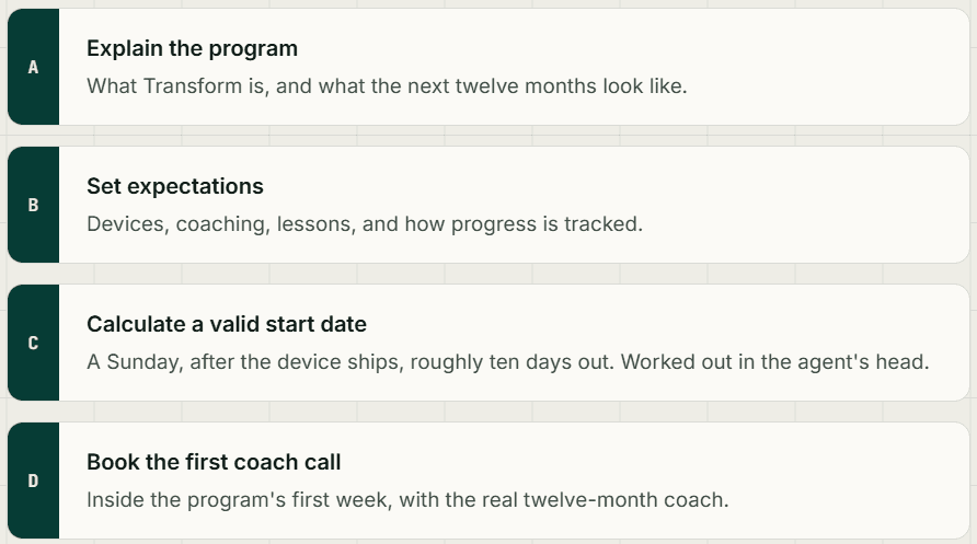
The old self-serve flow was never built to stand on its own. It was developer-built during a platform rebrand, with no design owner, and it leaned on the call to do the explaining. The homepage was a single card. The scheduling screen was an open calendar with no rules visible anywhere. None of it could carry a member alone, because it was never meant to.
The hardest of the four jobs was the start date. The agent balanced three fixed program rules in their head and produced one valid date. Hand the old open calendar to a member with no agent, and you hand them that same calculation, and the hope that they got it right.
One node removed, its work spread across the rest
The enrollment journey kept its shape. What changed is that the human node in the middle is gone, and the four jobs it carried had to find new homes in the steps that remained.

Every page change maps to a job the call used to do
This is the test that keeps the redesign from being a reskin. If a screen changed, it changed to absorb a specific part of that phone call. Here is where each job went.

Jobs A and B: the homepage carries the conversation
The old homepage was one thin card; the explaining was meant to happen later, on the call. The new homepage does that itself, in the order a member would ask the questions.

Choosing a track becomes an informed decision
The agent used to talk a member through which track fit them. The program-selection step now does it visually: each track's device, primary goal, lesson emphasis, and one-year outcome sit side by side, so the member commits with the understanding the call used to give.

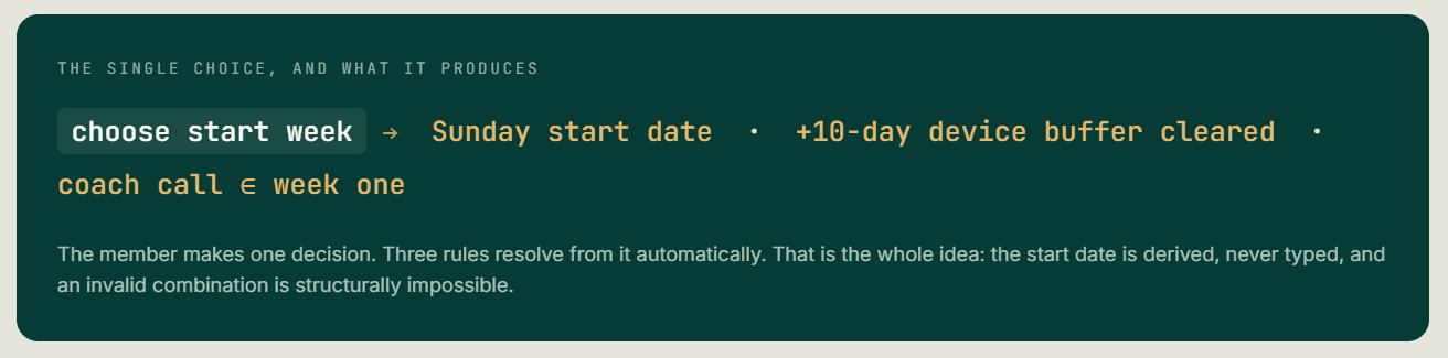
Turning a calculation into a single choice
This is the piece I spent the most time on. To replace the agent's mental math, the design first had to respect the same rules the agent did. These three were fixed by the program, and I could not move them.

One more piece was fixed: a 16-question eligibility quiz ran on third-party software I could not customise, so I left it untouched and designed around it. Knowing what could not change was part of the work.
What the member was about to inherit
The old scheduling screen was an open calendar. Every date looked selectable. There was no start week, no device buffer, no Sunday rule visible anywhere. It worked only because a human stood behind it doing the math.
Hand that same calendar to a member with no agent, and you hand them the agent's job: figure out which date is legal, and hope you got it right.

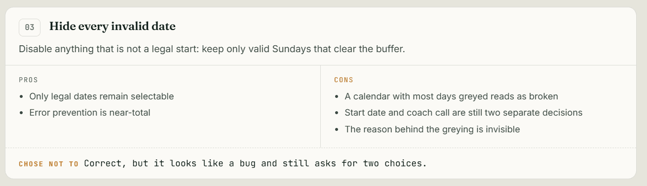
Four iterations to get there
Each version moved the rules further out of the member's head and into the structure of what they could select.



How it feels to use
Progressive disclosure does the carrying. Pick a week, and only that week's days open for the coach call. The review panel confirms the derived start week back to the member as they go.


The call used to end with a confirmation. So does the screen.
The last thing the agent did was read the plan back: you start the 22nd, your coach calls the 27th. That closing reassurance was a real job too, and the post-enroll dashboard now does it.
Everything resolved, shown plainly
On enroll, the member lands on a dashboard that states the derived start week and the booked coach call, tracks the device delivery, and marks early activity as practice that will not count yet. It closes the loop the agent used to close, in the interface's own voice.
This is the quiet proof of the whole idea: even the agent's final, human reassurance got absorbed into the flow.

What testing showed, and what it could not
I ran the full flow with eight users, four on mobile and four on desktop, from the homepage through to scheduling. No one stalled on the unavailable early weeks. One participant noticed the week-then-day sequence but did not mind it.

The one flagged beat, week before day, is also the seam most likely to generate mild friction at larger scale, precisely because it is the step I added. Worth monitoring, not worth removing: it is what makes the single-choice derivation possible.
A recurring human touch removed, experience held flat
Removing the onboarding call took out a recurring per-enrollment support cost. The agents were support staff, not coaches, so this removed an operational expense, not clinical capacity. The member-facing result is parity: the same understanding and the same simple enrollment, now self-serve and able to scale past where 1:1 onboarding could.
This shipped recently, so rather than claim numbers I do not have, here is what I would put on the dashboard and why.

A human used to stand between sign-up and the program. Their judgment now lives in the software, and the member never feels the gap.
Jobs A and B: the homepage carries the conversation
The old homepage was one thin card; the explaining was meant to happen later, on the call. The new homepage does that itself, in the order a member would ask the questions.